
Tiffin & Co
Brief
Design a branding and packaging strategy for Tiffin & Co, which offers a variety of teas, condiments, and food items. The approach should emphasize a cozy and serene atmosphere, while also standing out from the competition.
Solution
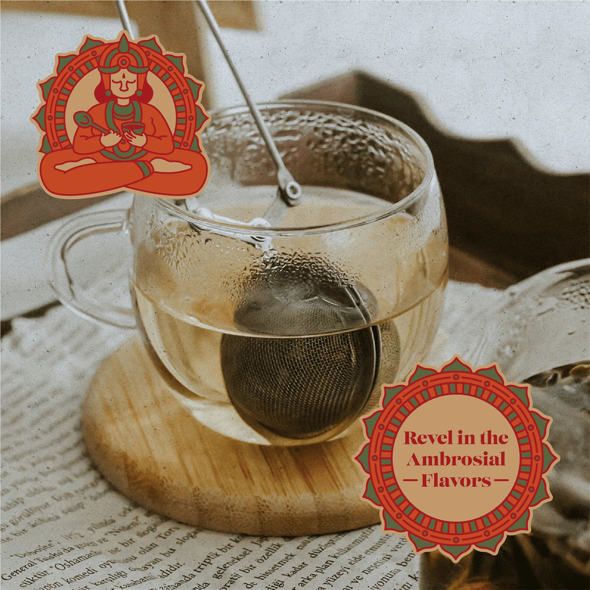
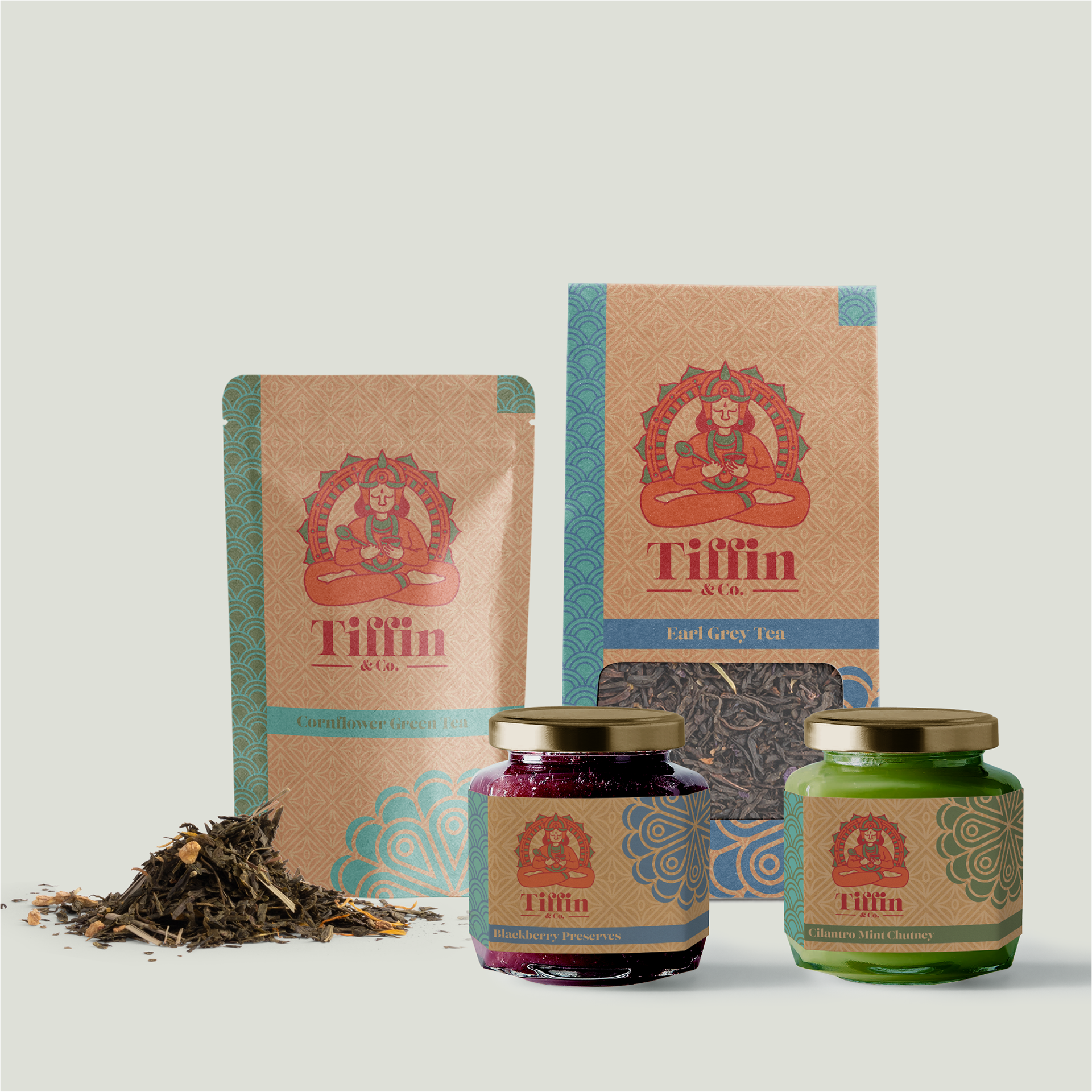
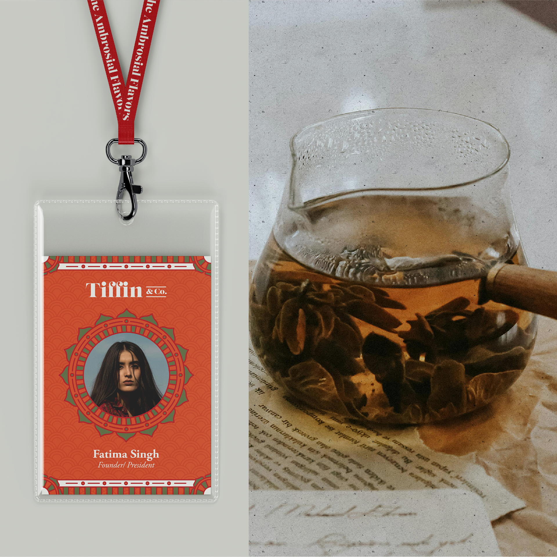
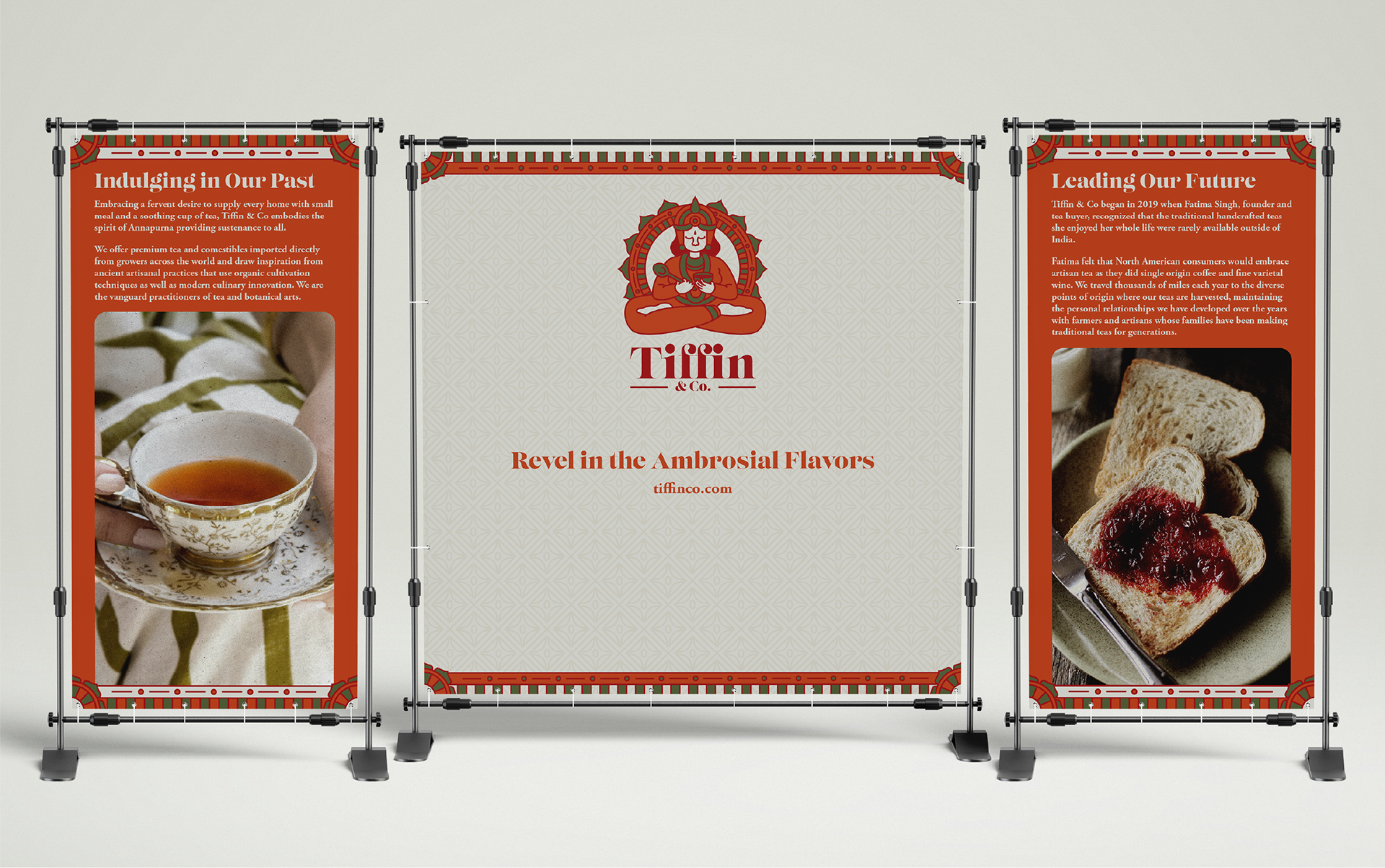
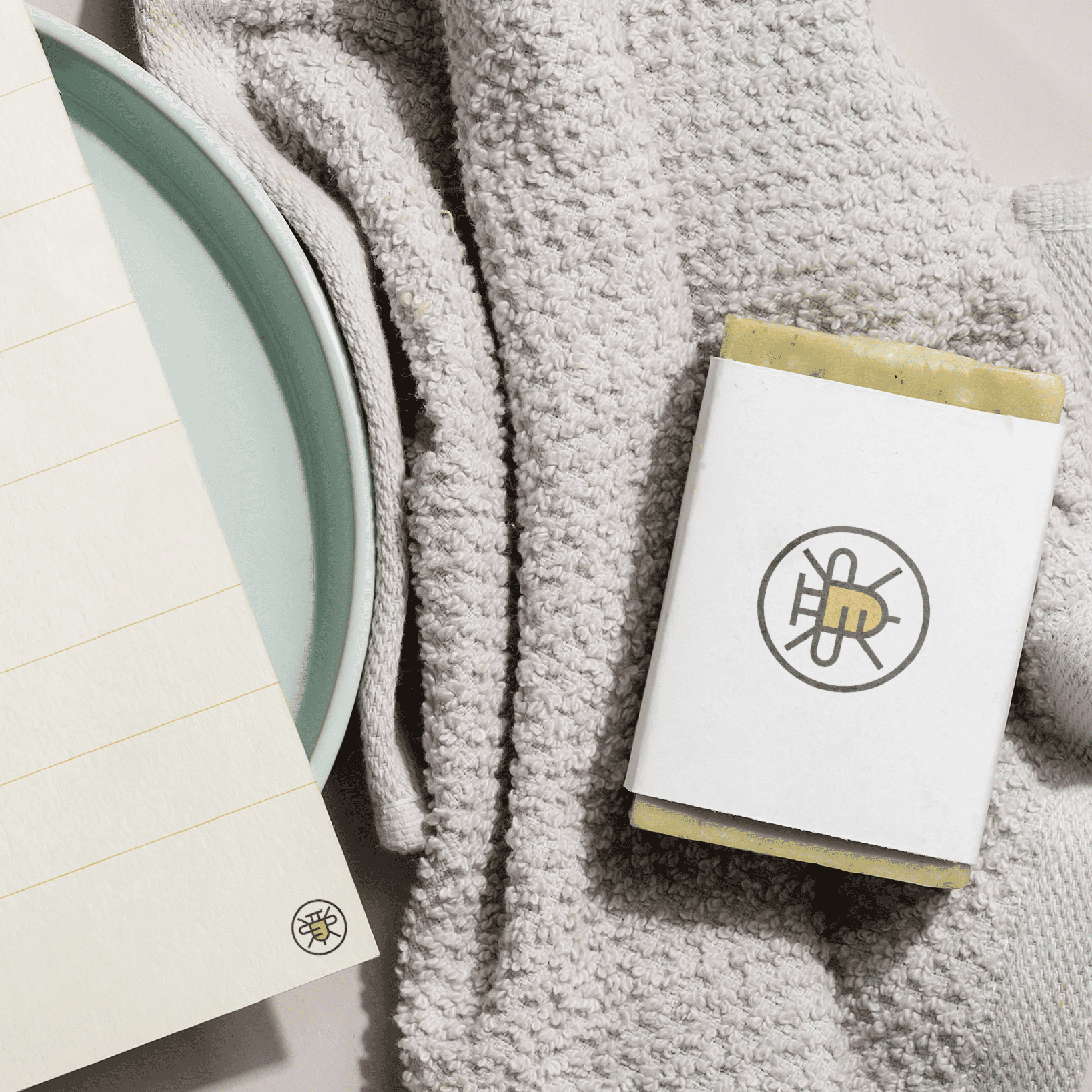
Tiffin & Co's brand strategy is rooted in the meaning of its name, 'Tiffin,' which refers to a 'light mealtime' and has its origins in British-ruled Southern India. The packaging reflects this Southern Indian influence by featuring the image of Annapurna, the Hindu Goddess of Food and Nourishment, along with patterns and colors reminiscent of Indian textiles and paintings.
Results
Tiffin & Co honors the tradition of light meals, creating a welcoming atmosphere. It embodies the spirit of Annapurna, dedicated to ensuring that no one experiences hunger in her nurturing presence.